




Complementary colours
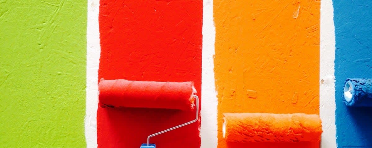
Complementary colours are pairs of colours positioned on opposite sides of the colour wheel that create the strongest possible contrast with one another. The classic complementary pairs in the traditional model are red and green, blue and orange, and yellow and purple. When complementary colours are placed side by side, they mutually intensify each other's brightness and saturation, making one another appear more vivid and intense. When pigments are mixed, however, complementary colours neutralise each other, producing greys and neutral tones. The theory of complementary colours was systematised in colour science during the eighteenth and nineteenth centuries, notably in the work of Michel Eugène Chevreul on simultaneous contrast. Artists actively applied this principle to achieve visual tension and vibration. Post-Impressionists, especially Vincent van Gogh, deliberately built compositions on the juxtaposition of complementaries to heighten emotional expression. Pointillists such as Georges Seurat placed dots of complementary colours side by side so that the viewer's eye would blend them optically. An understanding of complementary colours remains fundamental to colour theory, design, and painting, allowing artists to control the perception of contrast, depth, and harmony.